Brand
- AMITOFO 2
- BABY THREE 1
- BARBIE 1
- BIG_GALLERY 2
- BLOKEES 1
- BUTTER BEAR 1
- CHIIKAWA 9
- CHOCO TEDDY 4
- CRAYON SHIN CHAN 14
- DARK STEEL TOYS 1
- DEES SUPREME 10
- DISNEY 1
- DISNEY PIXAR 2
- FINDING UNICORN 1
- FLUFFY HOUSE 1
- FUFUTIETIE 1
- FUNISM 12
- HEAVEN OFFICIAL'S BLESSING 2
- JINART 1
- KIMMON 5
- Majorette 1
- miffy 2
- MINI WORLD 3
- MONCHHICHI 1
- PAW PATROL 1
- PAWS NOVA 4
- PHATMOJO 4
- PITE NAUGHT 1
- POWERPUFF_GIRLS 2
- QOQO 1
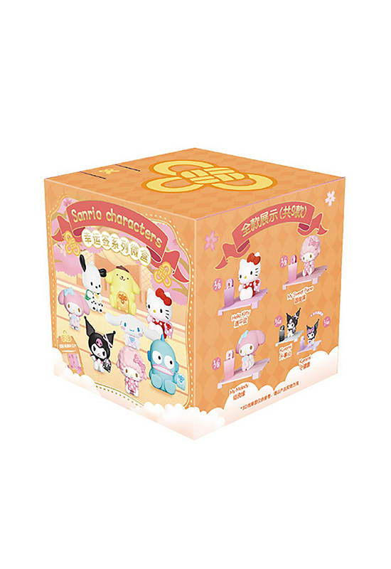
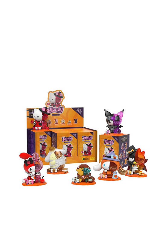
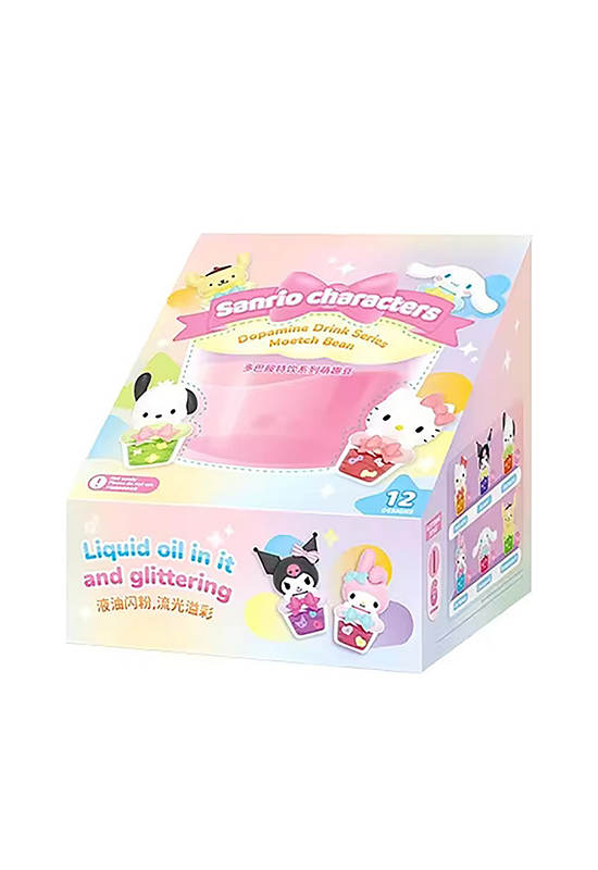
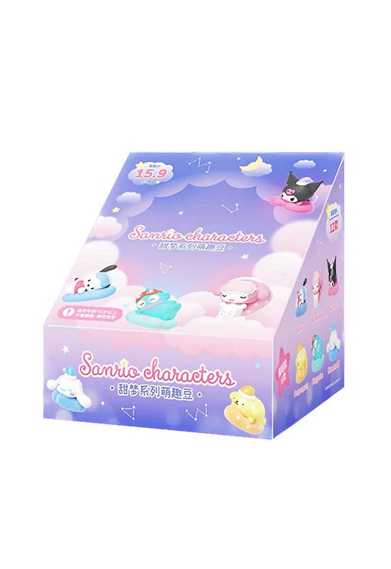
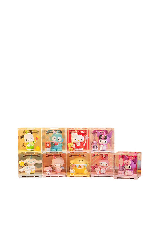
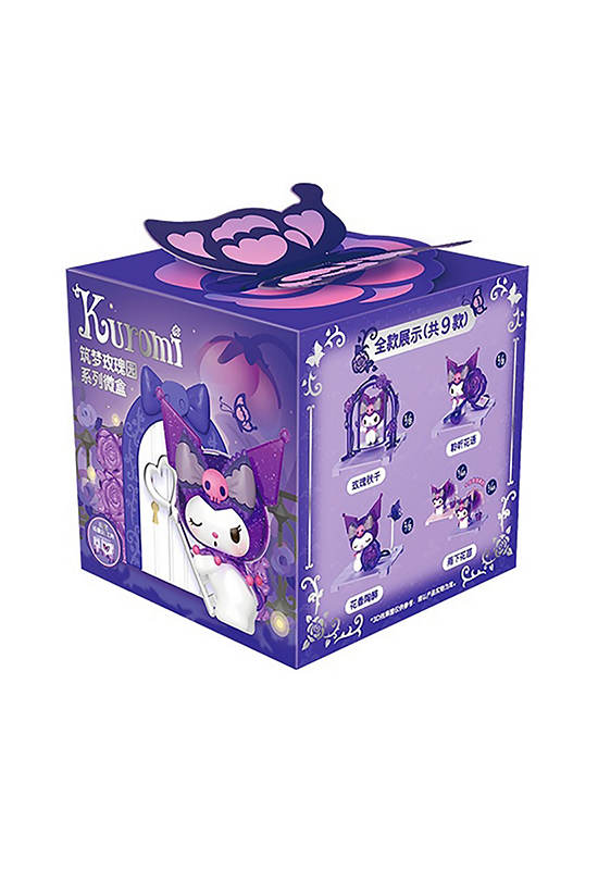
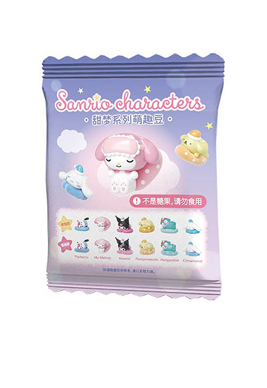
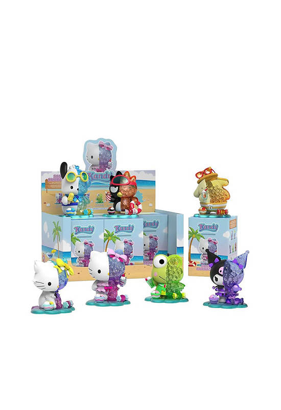
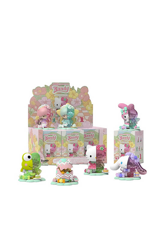
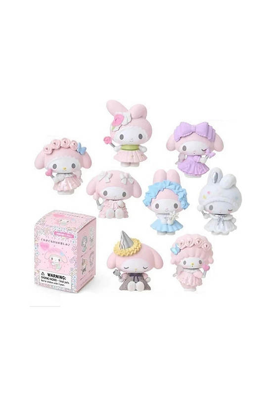
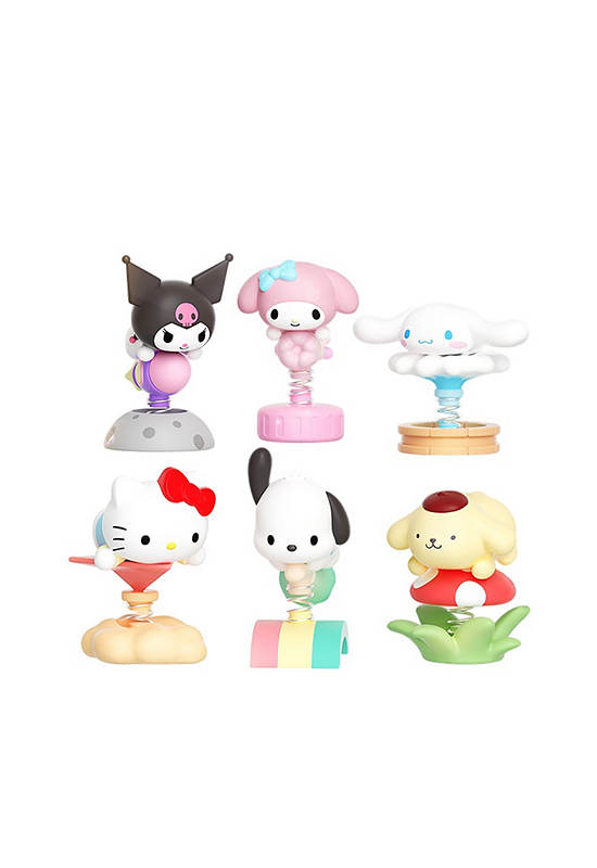
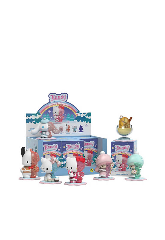
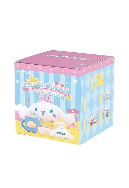
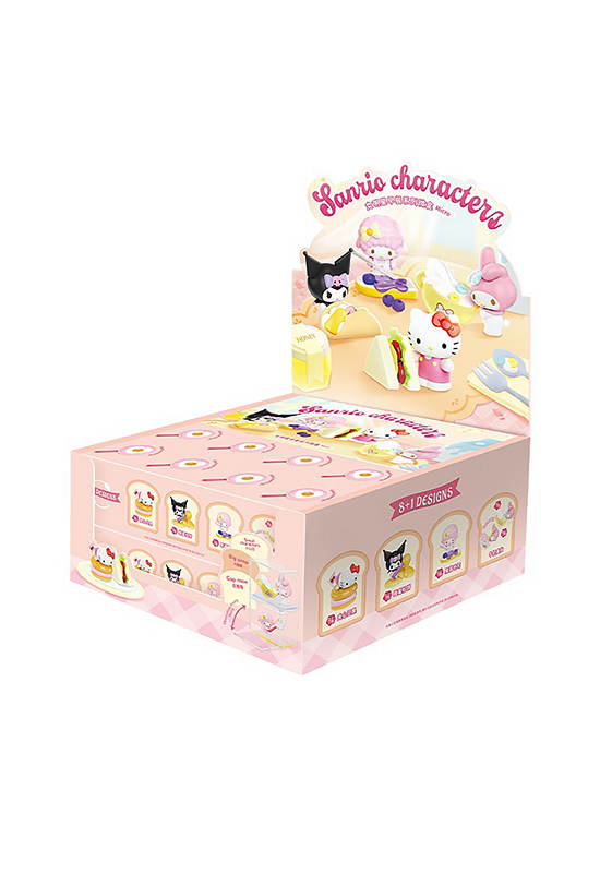
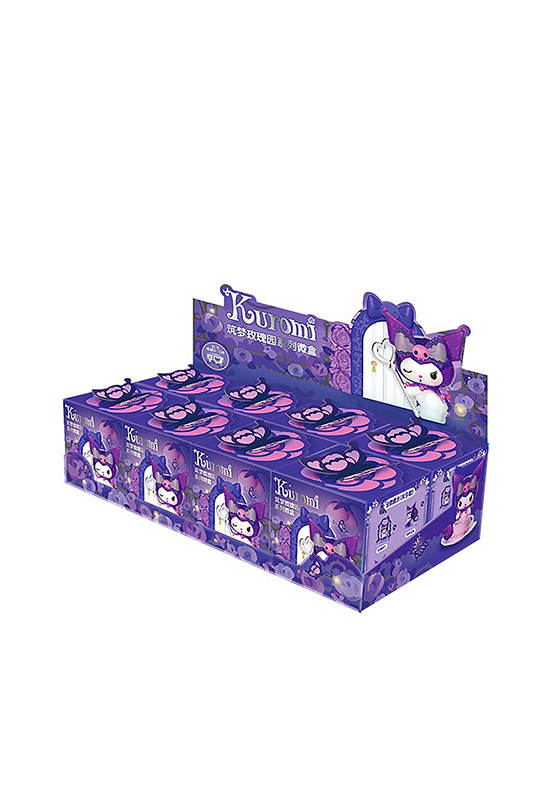
- SANRIO 20
- SIAMES AZUKISAN 1
- SIAMESE AZUKISAN 1
- STRANGER HANDS 1
- SUNRISEPOP 3
- SYLVANIAN FAMILIES 1
- THE LUCKY LOONG 1
- Tom and Jerry 1
- UNICORN ACADEMY 1
- UPSET DUCK 1
- XOX KWEENIE 1
- ZURU 3
Online store of household appliances and electronics
Then the question arises: where’s the content? Not there yet? That’s not so bad, there’s dummy copy to the rescue. But worse, what if the fish doesn’t fit in the can, the foot’s to big for the boot? Or to small? To short sentences, to many headings, images too large for the proposed design, or too small, or they fit in but it looks iffy for reasons.
A client that’s unhappy for a reason is a problem, a client that’s unhappy though he or her can’t quite put a finger on it is worse. Chances are there wasn’t collaboration, communication, and checkpoints, there wasn’t a process agreed upon or specified with the granularity required. It’s content strategy gone awry right from the start. If that’s what you think how bout the other way around? How can you evaluate content without design? No typography, no colors, no layout, no styles, all those things that convey the important signals that go beyond the mere textual, hierarchies of information, weight, emphasis, oblique stresses, priorities, all those subtle cues that also have visual and emotional appeal to the reader.

